Meaning behind the brand logo
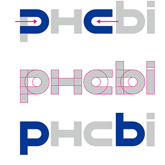
To reflect the idea of "advanced technical power to produce sophisticated products" required in medical scenes, we approached the design of our new brand mark from scratch, without reference to current typefaces.
To bring this new design to life, we focused on precision, eliminating any vagueness as much as possible, and created the fonts from only straight lines and perfect circles.
In addition, we gave the curved forms of the “P ” and “C” lateral symmetry and placed the “H” for healthcare at the center, expressing our approach of diligently attending to each and every manner in regard to our customers and society.
Reason emphasize “i” in Brand logo
The “i” in PHCbi represents the “each individual customer” whom we value and also stands for the “I” in each one of us who are involved in this mission.
It expresses our company culture of not being satisfied with the status quo and stability, and instead pursuing innovation, valuing the individual and working earnestly with our customers.